Wednesday, April 21, 2021

Sketchbook...

Monday's efforts. Nice to be outside and enjoying the local beach (Lake Quinsigamond). A real stretch for me to paint quickly without concern for details, etc. Just trying to capture the basics of what I see.


Friday, April 16, 2021

Wild Tomato Plant...

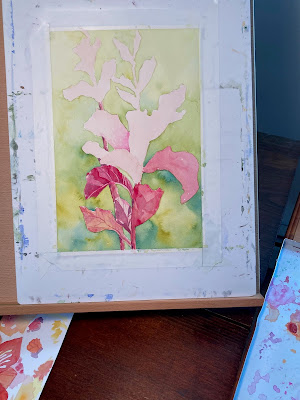
Something about this time of year pushes me toward the brightest colors on my palette –– especially on a day like this, when we've had a few inches of unexpected snow. Last summer, I took photos at Tower Hill Botanic Garden in Boylston, Mass., and have had my eye on this image, as the subject of a painting, ever since. I love the vivid contrast between red foliage and the surrounding grasses. The plant is a variety of solanum lycospersicum, a wild tomato named "Barry's Crazy Cherry." 

My goal for this painting is to capture the sunlight and shadow that enlivens the ruffled leaves, and to play up the strong contrast between greens and reds (two colors almost directly opposite each other on the color wheel).  After lightly sketching the plant shape, I painted the background around it, carefully leaving the plant shape white. I'm aiming for a sun-drenched feel overall, rather than an exact copy of the grasses and other leaves surrounding the wild tomato plant. The pigment mingled freely on wet paper and resulted in interesting "blooms" (dreaded when doing a flat wash, but in this painting very deliberately invited to form by adding drops of wet wash here and there on top of the background layer which was slightly damp. 

The background wash is done in stages by working from bottom to top, primarily in different intensities of Winsor & Newton Green Gold, sometimes slightly modified with W&N Winsor Blue GS (green shade). I mixed a few puddles of these colors on my palette, keeping them wet and making sure the surface of the paper was damp as I moved upwards. To keep the visual weight at the bottom of the painting, as I neared the top the wash was thinned out as I added more and more water until I reached the top edge where the yellow-green color is very pale. 

When the background was completely dry, I erased any visible pencil lines and applied a pale wash of W&N Carmine to give the plant shape an underlying pink tone. Once that dried I began putting darker tones on each leaf, again working from the bottom up. There are plenty of interesting shapes in this subject, because of the shadows and the backlighting (the late-afternoon sun was slanting low, behind the plant). 

I'm giving attention to adding detail in the leaf veins, but aiming for restraint when working on the shadow details. I'm using only a few colors throughout –– mostly on transparent or semi-transparent staining pigments, so adding successive layers of glazing on the background the underneath layers won't lift.

Stay tuned... 


Saturday, April 10, 2021

Sketchbook...

As there are several days left in my "waiting period" following my second covid19 vaccine, I'm keeping a low profile and working mostly in the studio. Today, however, I tried out a new mixed media sketchbook and challenged myself to work outdoors. Our back yard doesn't offer the most picturesque scenes, but I was intrigued with the thought of painting some angle of our house. 

I chose a view of a shadowy overhang where our second-story deck provides support for a sturdy wire trellis. My husband started some grapevines a few years ago, and although they're cut back now they will, in a fairly short time, again be filling out with leaves, then blossoms, and –– grapes! 

Because I'm particularly dismal at painting rocks, our lovely stone retaining wall running along one edge of yard is only suggested with some dabs of gray and tan. However, spending 30 minutes with the sketchbook was satisfying. I'll give it another try soon.

Friday, April 2, 2021

Hollyhocks in progress...

Progress - View #1
For the past week or so, I've been working on a new floral painting, using a new-to-me paper which I like very much -- actually, it's a not paper, exactly, but Strathmore 500 Illustration Board for Wet Media. It's a smoother surface than I normally work on, which is a bit challenging but so far I'm liking the results. It holds up well to multiple layers of glazing. 

My reference photos are a series of shots I took at a local garden center. It was near the end of the season and there were only a few smallish hollyhock plants available, but their purple blossoms and tall, gangly stalks were appealing. 


My palette for this painting is: Opera, Quinacridone Fuchsia, Mineral Violet, Winsor Violet, Green Gold, Sap Green, Shadow Green, and Winsor Blue GS. And I'm using several sizes of round brushes from the Da Vinci Cosmotop Spin series -- mostly #8 and #4.

I'll post the final steps and finished painting in a few days. 

Progress - View #2


Progress - View #3