 |
| Set-up |
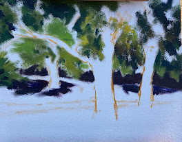 |
#1 Composition sketch
|
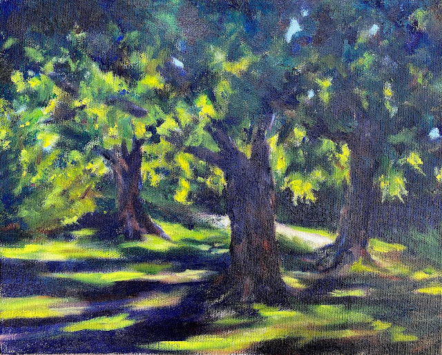
After noting the general composition, I covered the canvas panel, blocking in large areas of color using Ultramarine Dark, and gradually tempering these segments with splotches of lighter green (blending Cobalt, Viridian, Cadmium Lemon Light, and a bit of Cadmium Scarlet) (#2). I ignored the house (it can be seen in the set-up photo), as it seemed unimportant, as did the small stone retaining wall. I'd originally noted a line for the wall in the composition but felt it added nothing to this small panel.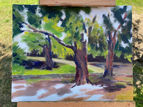 |
| #2 Blocking in more color |
After several hours of concentration, it was time to quit. The last image of Tuesday (#3) shows the canvas well covered but lacking the atmospheric contrast I aimed for. I set the panel out on my deck to dry, knowing that after several days I'd be able to resume work on this small piece. Examining the panel on Thursday, it was obvious that the darks needed emphasis. I also toned down the tree trunks which are mostly cool, dark, and in shadow (see the set-up photo) rather than brown. 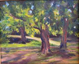 |
#3 Panel at the end of the first day
|
On Friday morning, I heightened the contrast in the upper third of the image, laying on more Ultramarine Dark blended with Viridian and Alizarin Crimson. To make the "canopy of foliage" effect more pronounced, I eliminated most of the small bits of blue sky which were, in reality, were peeking through the leaves.
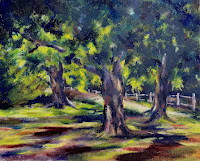 |
| #4 Dreadful details |
In a rush of misplaced enthusiasm, I somehow felt it necessary to add a fence to the background, showing it receding from right to left hoping –– incorrectly –– that it would "add something" to the painting. Not for the first time am I grateful that one of the properties of oil paint is its capacity to allow for corrections and "do-overs (unlike transparent watercolor, which is still my medium-of-choice). Here (#4) the painting shows the offending fence, as well as some additional and pointlessly inaccurate, dabs of white on tree trunks and elsewhere (what was I thinking??). The finished panel is shown below after being corrected. A simple, and I hope more truthful, rendition of an urban oasis on very hot day in August.
 |
"Leafy Glade, August"
oil on linen panel. 10" x 8"
Available at my Daily Paintworks Gallery, here. |


Comments