 |
| "Snow Path" 8.75" x 9.75" SOLD |
Monday, November 23, 2015
"Snow Path" -- completed
After I added the evergreen in the near background, and added a few bare branches to the tree on the right, I knew it was time to stop working on this painting. As a study, I think it works, but I'm dissatisfied with the rendering of the snow (too many purple shadows, not enough white). It's a good reminder that the perpetual challenge of watercolor is found in its sometimes-unforgiving, but beautifully fluid, properties.
Sunday, November 22, 2015
"Snow Path" -- a work-in-progress
 |
| "New England Winter" |
A few years ago I completed this woodland snow scene, which now hangs over the fireplace in my sister and brother-in-law's home on Cape Cod. I've wanted to paint another view of this snowy road through a snow-drifted forest, but haven't attempted it until now. Even though I'm not a huge fan of cold weather, I admit that snow can be picturesque... especially around the holidays. I considered doing a copy of the first painting, but experience has shown me that this rarely works.
 |
| Value sketch for "Snowy Lane" |
Rather than trying to duplicate my earlier painting, I decided to alter the scene slightly.
First, I copied the original value sketch and with my MacBook Pro's editing program I flipped the picture horizontally. Then, I cropped it into a square format (rather than a classic rectangle). And because I wanted to control the placement of the trees and ensure that they remain clearly defined, I first sketched the scene lightly in pencil. (I'm using 300# Kilimanjaro cold press paper.)
After completing the sketch, I painted the tree trunks with liquid masking fluid so I could freely do a juicy wash over the entire sky using a squirrel mop rush. After the sky (in Ultramarine blue) dried, I mixed sepia with Holbein's Shadow Green, then blocked in a middle "horizon line" behind the masked-out trees. I left the upper edge of this line rough so I could blend it softly, into the distant background to emphasize depth. The bottom edge of the horizon line is rendered sharply to give definition to the drifted piles of snow in the foreground.
I built up layers of washes suggesting evergreen trees in the distance using mostly Ultramarine, sepia, Payne's gray, and shadow green to mix these multiple washes with, alternately, a 3/8" flat and a #8 round brush.
To paint the snow I used a mix of Winsor violet (dioxazine violet) and Ultramarine, making puddly washes for shadows, blending wet-into-wet in some places. After these dried, I picked out some areas with the same pale blue-violet color applied with a dry-brush technique.
 |
| "Snowy Lane" (work-in-progress) |
I removed the masking fluid to begin detailing the tree trunks. I painted these with many wet-into-wet washes, using sepia, Payne's gray, burnt sienna, and a little Ultramarine blue. I used my favorite 3/8" flat brush, as well as a #3 round brush, and several riggers of different sizes for the smaller branches.
So far I've spent about five hours total on this painting, but now it's time to stop for the day. I'm often tempted to stay with a painting until it's "finished" but I've learned that I'm happier with a completed painting if I do it in stages. This (above) is what "Snowy Lane" looks tonight, Sunday, November 22.
Stay tuned for more tomorrow...
Thursday, June 11, 2015
En plein air
 |
| plein air sketch |
 |
| Reference photo |
But, we do have a few picturesque "Palace Purple" variety Huechera, one of which is a volunteer, growing out of a crack in the stone retaining wall.
Yesterday's mid-afternoon sun was very bright, so the cast shadows of the foliage were dark and well-defined, and the highlights/colors colors vivid. A
great, naturally occuring set-up for my plein air exercise.
So, this morning I did an outline drawing of all the leaves, and then did a small value sketch using water-soluble graphite pencils (a wonderful tool!). After sketching it in roughly, i used a small brush charged with a bit of water to smooth out the sketch details. The value sketch is an important step along the way to a finished painting -- and it's one I've too-often omitted.
 |
| Value sketch, done with water-soluble graphite pencils (light, medium, and dark) |
 |
| First wash |
 |
| "Rock Wall Shadows" SOLD |
Tuesday, June 9, 2015
Winslow Homer I'm not...
I love Winslow Homer's watercolors, many of which were done early in his career. In particular, I have always admired the way Homer handled light and shadows in his figurative work. "Spring" and "Blackboard" are fine examples of his skill in this regard, as is "Boys and Kitten (1873)," which is in the Worcester Art Museum's collection. I was at Old Sturbridge Village recently, and the scenes there were straight out of Winslow Homer -- which I took as a challenge. After snapping more than 200 photos, I selected several which, for me, evoke this "Homer-ish" quality, and began a sketch of a young woman seated outside, next to the sheep-shearing. She and a companion were washing wool -- not a particularly enjoyable task on a hot, sunny afternoon. Both women were taking a break, and this gave me a great opportunity to get some good photos with high contrast.
 Here is how I've started a watercolor study for "Well-Deserved Rest" (reference photo shown at right).
 I'm working on Lanaquarelle hot press paper. Not my favorite, but it allows for details which are more difficult even with a good cold press paper. (Fabriano soft press might work well, too.) I'm sticking with a limited palette, and using both cadmium red and cadmium yellow deep for the skin tones, and cobalt blue and Winsor violet for shadows. The dress is done with a mix of Winsor violet and cadmium yellow deep; the apron's pattern will be predominately cobalt blue.
As I post this, I can see some problem areas, esp. in the placement of the eyes (they're too high at present...).
And here is the finished work


As I post this, I can see some problem areas, esp. in the placement of the eyes (they're too high at present...).
 | |||||||||
| "Sunbonnet Girl" 6" x 7" available at my Daily Paintworks gallery |
Tuesday, May 26, 2015
Shadows...
 I've been experimenting with how to achieve realistic shadows, using color blends. I referred to Anne Abgott's excellent book, "Daring Color: mix and mingle watercolor on your paper" (North Light Books, 2007). Her suggestion to use Verditer Blue is a good one -- it blends beautifully and is almost luminous in its reflective properties when combined with a complement, such as Brown Madder. I made a few test strips, allowing the two colors to mingle, according to Abgott's instruction. The resulting warm grey made me think of a photo I took this weekend, while visiting Old Sturbridge Village. It was "Wool Day," so the adult sheep were being sheared (the old-fashioned way, with clippers that looked like enormous scissors). They were penned up together, each awaiting their turn. The small lambs were adorable...
My goal in this sketch was to capture to shadow and texture of the wool. As you can see, I wasn't too worried about careful rendering. Instead, I worked quickly with a #14 Pointed Round brush, laying in the paint with plenty of water, letting the two colors -- Verditer Blue and Brown Madder -- mingle on their own. I put a suggestion of blue-grey barn board in the background, adding Indigo with a touch of Gold Ochre and Burnt Sienna. I used a thin wash of those two last colors for the straw on the barn floor, then added some cast shadows with Winsor Violet.
It was a very quick study -- but fun to do. It reminded me (again) of how important it is to let go of the details and simply PAINT!!!
 | ||||||
| Wool Day at Sturbridge, 10" x 12" NFS |
Saturday, May 23, 2015
Summer's lease finis...
After several fits and starts, I settled down to complete this painting. Lots of different greens/browns/yellows/some blue/even some violet, applied multiple times. Several washes of clear water on the lake to smooth out some too-clearly-defined reflections, and then more glazing on the lake surface to brighten the color. I'm always surprised to note the contrast between bright, juicy wet paint and that same paint once it's dried.
While the nitsy part of me wanted to spend even more time on detail work, I think I got out just in time. My tendency is to overwork a painting, and I'm trying to break myself of that.
The title derives from a line in Sonnet 18 (Wm. Shakespeare) which begins, "Shall I compare thee to a summer's day?"
 |
| Summer's Lease 10.5" x 15.5" sold |
Friday, May 22, 2015
Peony... again
 Every time I pull this photo out of my reference pile, it's a little like the movie, "Groundhog Day." I have used this photo a number of times and have had varying degrees of success painting this single blossom. I have been fortunate to sell each version that I've done (which is gratifying).
This morning I sketched it on a scrap of #300 Kilimanjaro... it's one of several odds and ends of paper that I can't bear to toss out, even though there is something painted on the flip side! Several years ago I learned, from an award-winning artist who exhibits nationally, that he does that all the time! I was surprised, and then I figured there was no reason to throw away perfectly useable paper simply because one side had already been marked up.
 I did an outline sketch first, to keep the proportions and the shapes under control. Then I added a few darks first (this is not the usual order for me -- I generally start light and leave the darks for last), and also made sure that I put some color accents in right at the beginning. After these details were completely dry, I covered the entire flower with a single, pale wash (Permanent Rose). Then I went to the dentist.
When I returned, I put another several hours into the painting. Altogether, it took about six hours to paint. You can bid on it in my Daily Paintworks auction by by clicking the "bid" button below; payment is via Paypal.
 |
| SOLD |
I think I might retire this photo, as I've used it as a reference so many times. Maybe this summer I can get some new peony photos...
Tuesday, May 19, 2015
Summer's lease hath all to short a date...
 |
| photo credit: Liz West (aka Muffet); Flickr. Used by permission |
The photo I'm working from reminds me that we don't have long to wait until glorious summer weather sets in. When we come out of our winter cocoons here in New England, there is always a flurry of fun events on the calendar. I recently donated paintings to two separate benefits: one to the annual "Art in the City" auction that benefits the Family Health Center here in Worcester, MA. The painting is of a lake in autumn, with reflected trees ("Reverie" click to see in the slideshow). The second painting I donated ("Playful Petunias") was given to the All Saints Church, Worcester (my parish!) silent auction.
If you've been watching my gallery, you know I've been concentrating lately on florals. But because I'd enjoyed working on both of those donated paintings, I thought I'd try another 'reflections' image. (I am grateful to the very gifted photographer Liz West (Muffet) for her generosity in allowing me to use her photos as painting references.)
If you've been watching my gallery, you know I've been concentrating lately on florals. But because I'd enjoyed working on both of those donated paintings, I thought I'd try another 'reflections' image. (I am grateful to the very gifted photographer Liz West (Muffet) for her generosity in allowing me to use her photos as painting references.)
 |
| My palette: a plate from IKEA |
The range of greens in this view is astonishing, but since there's no point in attempting to paint the scene with only one or two tube greens (e.g., Hooker's Green, Permanent Sap Green, etc.), I knew I'd be doing a lot of mixing. See my busy, varied palette, at left.
In addition to these puddles of mixed color, I keep a separate little dish of Shadow Green (PBk 31) manufactured by Holbein. I use it straight from the tube, and like to keep it thick and pasty, as it gets wishy-washy if too much water is added. Shadow Green is great for foliage and it blends well (NB: Winsor & Newton's Perylene Green is similar -- in fact, has the identical pigment label, PBk 31 -- although it does appear slightly different on paper.)
 |
 |
Monday, May 18, 2015
"A" is for apple...
I hadn't intended to do a series of paintings showing fruit on the branch -- but sometimes these things just take on a life of their own. "Orchard Offering" (shown in the banner, above) sold quickly -- along with its mate, "Sun-Kissed." With both of these paintings, the outlining technique added a dimension that seemed to heighten the effectiveness of the painting.
So, today I worked on another version of apples. I'd planned to outline the image after it was complete. But when I got to that point, I gave considerable thought, instead, to adding a sky-blue background. I thought it would be an interesting contrast with the color of the apples and the leaves. But, not wanting to make a hash of the painting, I backed away from the sky option. Not sure it would have worked.
But I still wonder... And now I'm thinking of purchasing some clear acetate that I can paint on and use as an overlay, to try different effects.
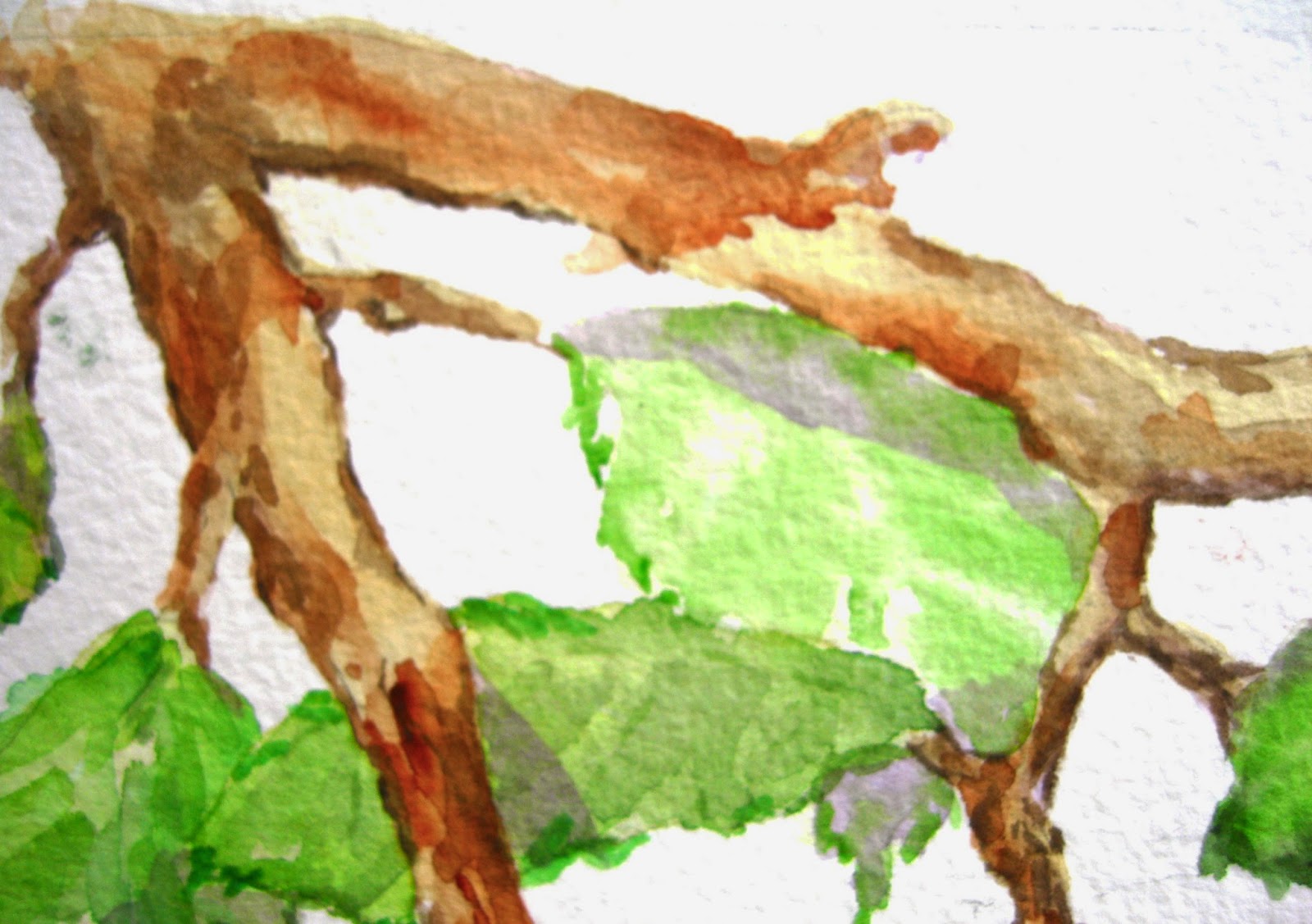
After sketching the design completely using an HB lead, I painted the branches, leaves, and apples. As with the previous two painitngs, this was a multi-step process. The apples alone represent at least 8 separate glazes of color: scarlet lake, sap green, new gamboge, quinacridone gold, and winsor violet. The branches and leaves also required their separate glazes of burnt sienna, gold ochre, sepia, and sap breen, shadow green, quinacridone gold, and winsor violet, respectively. Since I had to allow each wash to dry before adding the next glaze, this project that took most of the day to complete. Here are details showing the step-by-step progress.
The finished painting is 11" x 9." It has an additional 1/2" border all around.
It's done on #300 Arches paper.
"All About Eve" SOLD

So, today I worked on another version of apples. I'd planned to outline the image after it was complete. But when I got to that point, I gave considerable thought, instead, to adding a sky-blue background. I thought it would be an interesting contrast with the color of the apples and the leaves. But, not wanting to make a hash of the painting, I backed away from the sky option. Not sure it would have worked.
But I still wonder... And now I'm thinking of purchasing some clear acetate that I can paint on and use as an overlay, to try different effects.
After sketching the design completely using an HB lead, I painted the branches, leaves, and apples. As with the previous two painitngs, this was a multi-step process. The apples alone represent at least 8 separate glazes of color: scarlet lake, sap green, new gamboge, quinacridone gold, and winsor violet. The branches and leaves also required their separate glazes of burnt sienna, gold ochre, sepia, and sap breen, shadow green, quinacridone gold, and winsor violet, respectively. Since I had to allow each wash to dry before adding the next glaze, this project that took most of the day to complete. Here are details showing the step-by-step progress.
 |
| After about 4 washes... |
 |
| After 6 washes... |
It's done on #300 Arches paper.
"All About Eve" SOLD

Sunday, May 10, 2015

Still, it's an appealing image -- very late-spring-early-summer, and very Mother's Day! Make this painting yours for a $50 opening bid.
Friday, May 8, 2015
Fast and Loose II
 |
| Step 1 |
 |
| Step 2 |
The muted background is shaded from light to dark (Steps 3 and 4). It was painted with a mix of Shadow Green, Winsor Violet, and French Ultramarine. The darker background area on the right (Step 3) was done with two applications of wash, wet-on-dry.
The predominant color in this darker section of wash is Winsor Violet.
Steps 4 shows the left background, done with a single wash. I used more blue and green in this wash, to keep it greyed down and neutral. A final glaze of a thin wash evens out the texture. See the finished painting, "Blossom Dearie," here. It sold almost immediately, so it no longer available... but I'll be completing another, similar painting soon.
 |
| Step 3 |
 |
| Step 4 |
Thursday, May 7, 2015
Fast and loose I
About ten years ago I took a painting workshop in Vermont, and was stymied by the instructor's repeated reminder that, in watercolor, the artist should "get in, and get out!" In other words -- stop worrying about the details. I've long been determined to free myself of this worry but it's tough! Details seem overwhelmingly important, so I want to paint everything. With a tiny brush! (my painting, "Orchard Offering" in the banner above, is a good example of my penchant for detail...)
Often, though, when I approach a painting in this way, I'm frustrated with the results. So now I'm trying to teach myself to be comfortable with painting "fast and loose" -- to splash around with a lot of water and a lot of paint. It's fun, and intriguing to see how the colors mingle -- the problem is that too much water/pigment usually means buckled, warped paper. To avoid this, I've switched to 300-lb. paper for most of my paintings. It's more expensive than 140-lb. paper, but it is so forgiving that it's worth the extra cost. I can now stop thinking about ditsy details, and concentrate on form and color. Yesterday, I was down to my last 22" x 30" sheet of Arches 300-lb. paper, but then I received a shipment of 300-lb. Fabriano Uno soft press (from Cheap Joe's -- my favorite online supplier).
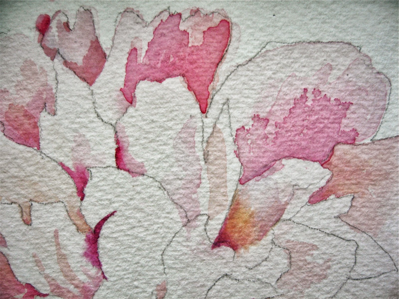
I wanted to use up that last piece of Arches, however, so I cut it up in smaller pieces and this morning I began what I hope will be a successful fast and loose painting. Several years ago I took photos of a peony blossom, all delicate ruffles in pink and white. It reminds me of a ballerina's tutu.

I've spent about 30 minutes on it so far and I think it is going in the right direction. You can see the photo I'm working from, along with the tip of my favorite #16 Robert Simmons Sienna round brush! (available through Cheap Joe's) I decided to forgo most of the gauzy white background, but will probably add a stem and a leaf or two. I'll also keep the left side of the painting lighter than the right, since most of the color in the blossom is on the left. Stay tuned!!!
Often, though, when I approach a painting in this way, I'm frustrated with the results. So now I'm trying to teach myself to be comfortable with painting "fast and loose" -- to splash around with a lot of water and a lot of paint. It's fun, and intriguing to see how the colors mingle -- the problem is that too much water/pigment usually means buckled, warped paper. To avoid this, I've switched to 300-lb. paper for most of my paintings. It's more expensive than 140-lb. paper, but it is so forgiving that it's worth the extra cost. I can now stop thinking about ditsy details, and concentrate on form and color. Yesterday, I was down to my last 22" x 30" sheet of Arches 300-lb. paper, but then I received a shipment of 300-lb. Fabriano Uno soft press (from Cheap Joe's -- my favorite online supplier).
I wanted to use up that last piece of Arches, however, so I cut it up in smaller pieces and this morning I began what I hope will be a successful fast and loose painting. Several years ago I took photos of a peony blossom, all delicate ruffles in pink and white. It reminds me of a ballerina's tutu.

I've spent about 30 minutes on it so far and I think it is going in the right direction. You can see the photo I'm working from, along with the tip of my favorite #16 Robert Simmons Sienna round brush! (available through Cheap Joe's) I decided to forgo most of the gauzy white background, but will probably add a stem and a leaf or two. I'll also keep the left side of the painting lighter than the right, since most of the color in the blossom is on the left. Stay tuned!!!
Subscribe to:
Posts (Atom)